Golden Krone Hotel – Postmortem
It was 4:30am. I yawned as I climbed to the last level and conquered the final boss, FANE the EXILED VAMPIRE PRINCE. I didn't even know if the game was beatable until that exact moment. The game was Golden Krone Hotel and I had spent the last week making it for the Seven Day Roguelike Challenge of 2014.
Here are some numbers describing GKH:
- 10 floors
- 12 types of enemies
- 6 spells
- 5,612 lines of code
Lines of code can be a silly metric, but that number should give you a ballpark of how much I coded. It worked out to 800 lines per day or 1 line per waking minute. Wow!
What went right
1. Planning
Planning for the 7DRL challenge is immensely helpful. There's two areas that require planning: housekeeping and design.
This year, I didn't want to have to contend with work, so I took the week off. It sounds a bit extreme to take off a week of work from my programming job to program 10 times as much at home. But hey, I enjoyed it. I knocked out errands beforehand. I came to an agreement with my very understanding wife that I wouldn't be doing much. That week also turned out to be my spring break from school, which was a lucky coincidence. Blocking out an entire week from your life is strange; it kind of feels like "getting your affairs in order," but it works.
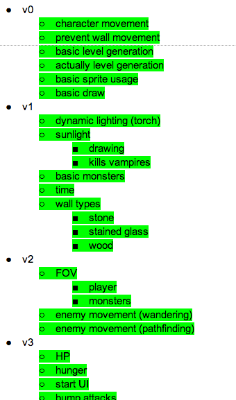
Planning the design of the game is worthwhile too. Some people prefer a tiny list of ideas, but I've always enjoyed making sprawling design docs. I usually open up a Google doc, brain dump everything I can imagine, and then conduct thought experiments about how certain mechanics will play out. The most important part though, usually written at the last minute, is a rough outline of features. I like to prioritize my list and group them into small "versions" so I feel like I'm making progress.
2. Graphics, sound, and music
My graphics last year were kind of ugly, mainly because I limited myself to 16x8 pixel tiles, chose a washed out palette, and refused to use outlines. This year, I went with 16x16 pixel tiles and was more liberal with the colors and outlines. The graphics have been the most praised feature, so I call that a success.
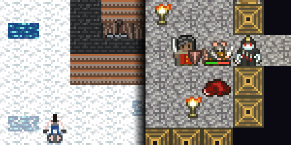
Making pixel art like this is easier than you might expect. I'm by no means "an artist" but I have tried my hand at pixel art before. My favorite tutorial to this day is still Tsugumo's So You Want To A Pixel Artist? series. Read it and you'll see that, rather than being an impenetrable mystery, there's actually a fairly straightforward process to making this stuff.
I made most of the sounds before the challenge using bfxr, which turned out to be pretty easy. There were some sounds I never could figure out how to produce (e.g. a door creaking), but what I did make sounded great to me. I debated about having music in game (music usually can't match the unpredictable pace in a turn based roguelike), but I was absolutely sure I wanted it on the title screen. I found incompetech.com to be a great resource and my mind was blown when I realized all the music there was made by one guy.
3. HTML5/JavaScript
Perhaps this is just a case of "use what you know." Not only do I feel comfortable with JavaScript, I can hack it together really quickly (please don't look under the hood though).
I'm not sure how performant the canvas is for complex real time games, but it's perfectly suitable for a 7drl. Getting to a character moving on screen takes very little code and the various APIs you need to do things like play sounds and save to local storage are unbelievably easy.
No downloads required and no fidgeting with missing DLLs or anything else. You have to deal with browser testing, but otherwise the web seems to be the option with the lowest amount of hassle. Compare this to, for instance, having to download python and pygame and then having to find the right command line arguments and then still having the game run unbearably slow because something was configured improperly; that was my experience with another 7drl released this year.
4. Fun mechanics
The most elusive component of creating a game is fun. The dust has settled and the mechanics in Golden Krone Hotel do appear to be fun.
As a foundation, simple roguelike gameplay is already pretty fun: bumping into enemies to attack, exploring, collecting items, etc. I was convinced of this while watching a video review of my game. As the reviewer starts to wrap up the video, he keeps commenting on how fun the game is while also repeatedly pausing his concluding statements to play for a few more seconds. All he was doing was bumping into enemies! So the idea here was not screwing up a good thing.
I found that adding a few simple twists didn't hurt as long as those things didn't become tedious. Burning vampires in sunlight is satisfying, but it only remains fun if you're not forced to do it. Switching between vampire and human is fun, but again I found that this was only fun for the player if they retain some control over the process. The game switches you automatically, but you're given resources that allow you to switch back. The game got a lot less fun when those resources were too scarce during testing.
What went wrong
1. The tutorial area
I thought I was being clever by making a little "tutorial" area. I'd educate players without slapping them in the face. I'd subtly hint at mechanics and let the player have the satisfaction of learning exactly how they worked.
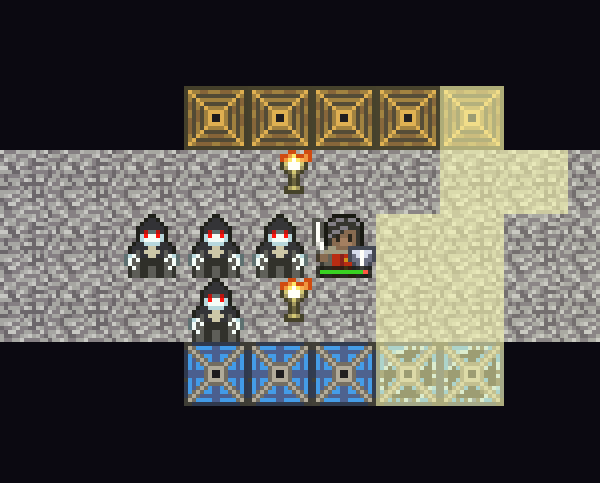
Unfortunately, none of that happened. In the first iteration, I made a moderately sized tutorial section that required the player to use their starting spell to succeed. I watched an experienced roguelike player fail three times before I gave up on that idea.
I made a second iteration that was more obvious and only required the player to walk back and forth to succeed. But what I didn't consider was that the tutorial area was effectively on a timer. Since it involved directional sunlight, it was limited by the time of day. Players would turn a simple challenge into an unsolvable quagmire by loitering around for too long.
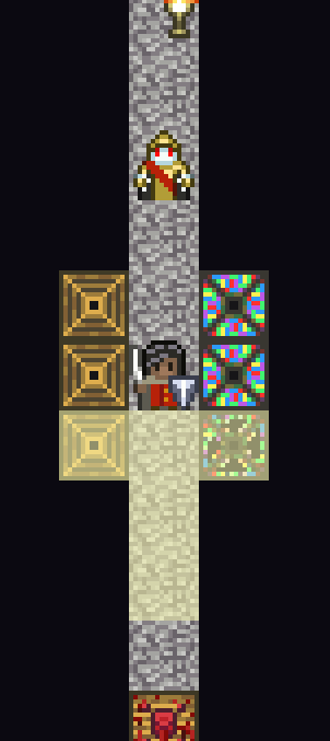
The final iteration was a tiny hallway with a single enemy and almost no way to mess up. It worked pretty well. The lesson? Apply Murphy's law to level design:
If the player is given the option to screw themselves, they will.
Don't get me wrong. Most players will still try to take on that one high level enemy hand-to-hand, even though they were told 10 seconds ago that vampires are highly susceptible to sunlight. But it doesn't matter: there's only one other thing to try! And when they do try it, they feel pretty clever.
Though I've received some positive feedback on the refined tutorial area, I'm still not sure it is worth keeping. Because that section is hand crafted, a large number of players assume the ENTIRE game is nonprocedural.... pretty much the worst outcome for entering into a challenge about procedural content.
2. Menus
I hate working on menus. I doubt I'm the only one. Frankly, every menu in the game is a big hack and the click handling logic is filled with bugs. Menus seem like a trivial detail, but when you watch someone spend 5 painful minutes trying to close a menu, you realize just how important it is.
Next time, I'll figure out a coherent system for managing menus and I'll do it much earlier.
3. Scope
Unless you have low ambitions, it's inevitable you'll have to cut features during a timed challenge. Not surprisingly, there were several features left out of Golden Krone Hotel. I had wanted to add potion crafting, super potions, themed dungeon branches, and mini-bosses. Of course, more enemies and spell would have been nice as well. I'm somewhat satisfied with the existing scope. The 10 levels and 12 monster types should keep someone occupied for quite a while. It even takes me around 45 minutes to beat the game (that's a single winning run).
But still I worry about the lack of variety in the existing mechanics and content.
4. Unclear mechanics
Bear with me. This final point requires a bit of unpacking.
The mechanics in Golden Krone Hotel are certainly fun once you learn them, but utterly confusing before that point. The thing is I genuinely thought the mechanics were clear.
The game is set in a tower. Stained glass windows on the outer wall of the tower normally block light, but they allow beams of light to pass through when broken. The direction of this light depends on the position of the sun. At 6am, the sun rises and shines on the east wall. At noon, it shines on the south wall. At 6pm, the sun shines on the west wall before finally setting. Think of it like a sundial that uses light instead of shadow. It seemed simple to me....
As time progresses, it should be clear the angle of light is changing deterministically. Not only that, but you're also given two UI elements that help describe what sunlight is doing:
- The time of day
- An icon that indicates which wall sunlight is currently shining on
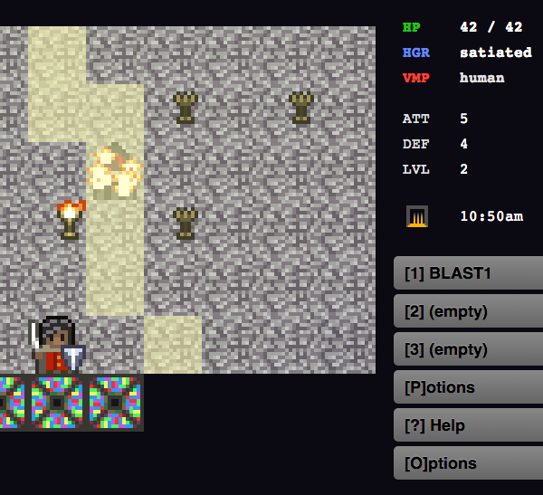
In hindsight, there were several major obstacles to communicating all this.
Change blindness
I should have learned my lesson when players couldn't find out how to use the compass in my last game. They would pick up the compass, a cardinal direction would appear on the UI, and then.... nothing. They wouldn't see it at all. That UI element even changes as they turn around, but still they wouldn't see it. This is exactly what was happening in Golden Krone Hotel. Sure, information about sunlight was displayed, but users weren't paying attention to it. Or they paid attention to it occasionally, but didn't notice when it changed, so they didn't understand the significance.
Change blindness is a well studied phenomenon and, based on my experience, it should be one of the first things you consider when developing a user interface.
Mental models
People create mental models to navigate through the world (whether that's the real world or a game world). I need to accept that player's mental models don't necessarily match mine. When I plan out a drive, I often visualize an overhead map that runs north to south. The same goes for walking through buildings. Well, not everyone thinks like this. I once told a friend in college that I waiting outside the east entrance to his dorm; he had no clue what I was talking about.
I thought the overhead view of a level would map nicely to cardinal directions (down == south) and the movement of the sunlight would be easy to comprehend. But players probably aren't thinking about that. After all, most dungeon crawlers are just that: romps through subterranean caverns that never see daylight. Apparently, that model is deeply ingrained. The opening screen explains that game is set in a tower, but one player told me he first assumed the "pools of light" he was seeing were coming from overhead.
Miscellaneous thoughts
Be open to change. Sunlight was initially the entire core of this game, but it ended up being a relatively minor feature. That's OK! Instead of pushing that one feature on the player, I was able to add other interesting mechanics. In another case, I intended to use Zelda style dungeon walls (where you simultaneously see the sides of all walls). That turned out to be way too complicated to implement and the traditional perspective I went back to was perfectly fine.
Worse is better. Time constraints led to several features being implemented with hacky, flawed algorithms: sunlight rendering, field of view calculations, torch lighting. For example, I was planning on using "the right" approach, Bresenham's line algorithm, before I realized the example on wikipedia only covers one of SIXTEEN cases. I thought about going back and fixing this stuff, but guess what? Not one person has even mentioned any of it. It was far more valuable to spend time on polishing the game than to worry about whether each algorithm was 100% correct.
Overall, I'm very happy with my Golden Krone Hotel and I'd love to hear your feedback!
Vote on HNDiscuss on Hacker News, you know, if that's like your thing.
Hitherto
Let's make a gameYear in Review 2013
Why You Should Play Fantasy Even If — Especially If — You Hate Football
Permalinks
Short: http://jere.in/11Pretty: http://jere.in/golden-krone-hotel-postmortem
