Why are CNN's headers grey?
According to Betteridge's law of headlines, the answer is clearly no.
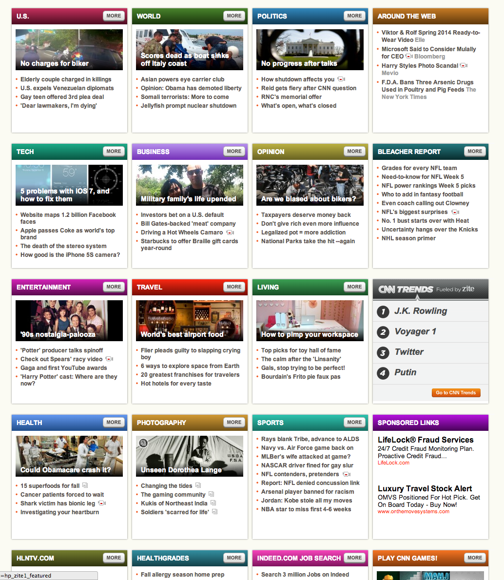
But seriously. The front page of CNN groups most of its articles into topic bins with colored headers.

It's a common design pattern among news sites. The color acts as a visual cue. It helps readers jump directly to their favorite topics. You like Tech? No problem. Red->Tech.

On CNN, however, only half of the 20 topic bins have colored headers. The rest are the same dull grey. Why? If I happen to like Sports, don't I deserve a color too? I don't know how they arrived at this design, but here's one way it could have happened:
- CNN brought in a top notch designer to handpick colors for each topic. Great choice.
- Over time, new topics trended and old ones faded away. Wait... it's 2013 and Britney Spears is a still a thing‽
- CNN didn't want to bring in the designer and and redeploy code every time Anderson Cooper giggled. That designer guy was a pretentious jerk, anyway. And they certainly couldn't let the devs choose colors. Thus, grey.
- ...
- Profit
I'm sure the reality was less dramatic. Perhaps CNN was perfectly happy with only 10 colors. Or maybe it has to do with the uncolored topics being mostly sponsored links (hilariously, there's a Bleacher Report bin even though the Sports bin points exclusively to Bleacher Report articles). On the other hand, it would probably be smart to make your sponsored content look identical to your real content.
Regardless, the above scenario could happen if you tried to design a similar UI. The ideal method of course would be to handpick colors, but when you're working with dynamic content (with no bounds on the number of records) that's just not feasible.
Autumn.js
To solve this kind of problem, I recently wrote Autumn.js. It's a small jQuery plugin that colors elements deterministically. It has a few advantages over handpicking colors:
- You don't need to store colors in code or in a database.
- You don't need to be a designer or color expert.
- You don't need to pick more colors when you add more elements.
Tangent: Autumn uses HUSL as one of the available (and recommended) color spaces; it helps make colors more consistent and enhances readability. I bring this up because HUSL is fricking amazing. If you take away nothing else from this post, check out HUSL.
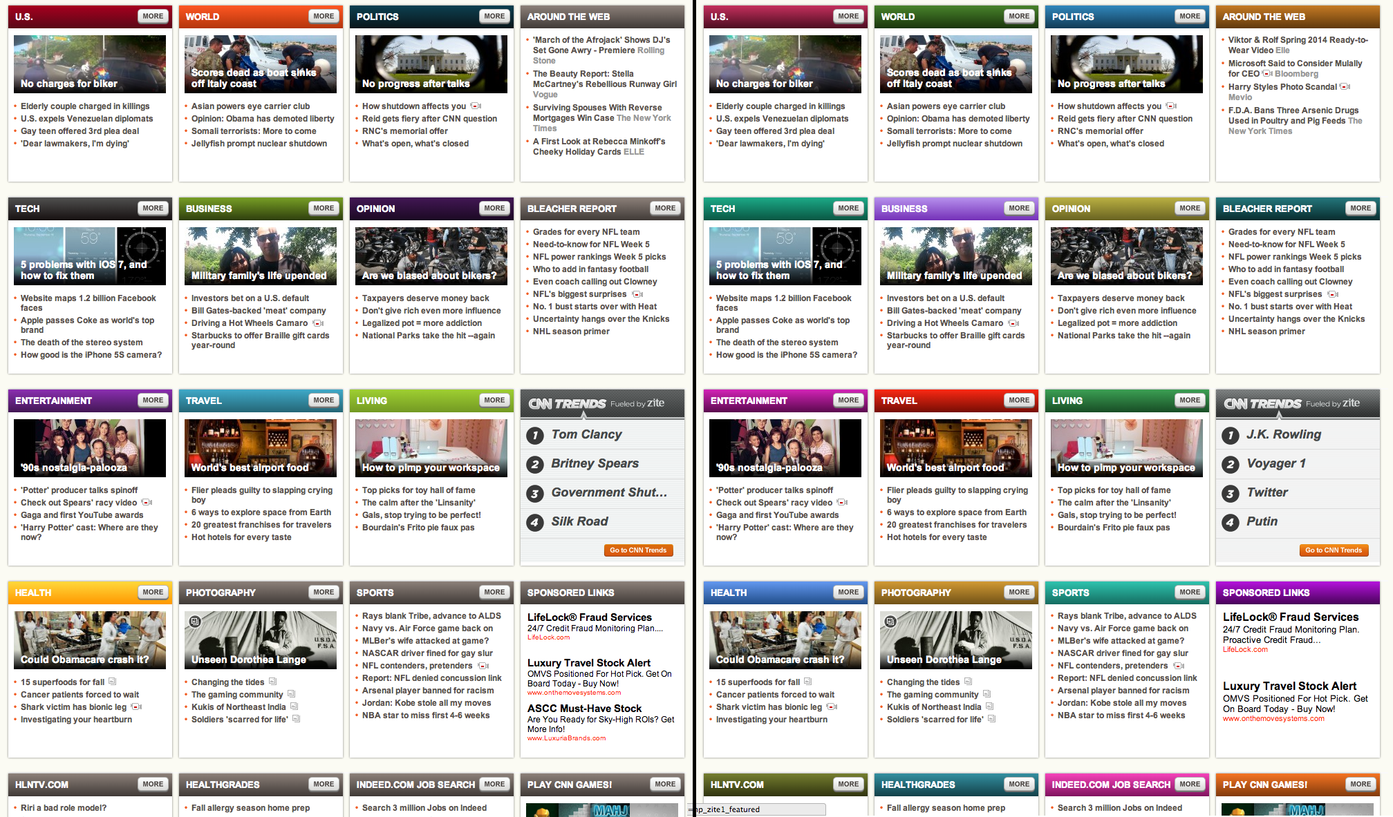
Anyway, I attempted fixing CNN's headers with Autumn and this was my first try:
Autumn offers several configuration options, but I went with one of the basic color profiles: "dark." I used getGradientColors() to produce the background gradients. Even without tweaking, I think it's looking pretty good. A few colors appear similar, but for the most part they're easily distinguishable. The text is very readable (in some cases even more so than the original headers). For better or worse, the sponsored content looks like a normal part of the page. Here's the before and after side by side:
So I hope you find Autumn.js useful. It could be applied to a lot more than headers: icons, avatars, tags, categories, etc. Let me know what you think.
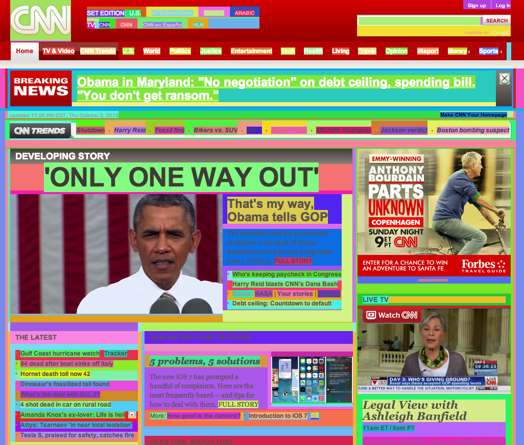
Now, maybe you disagree. Maybe you're thinking, Whoa, the above screenshot looks awful. Way too many colors.
Well, in that case, I've got an Autumn bookmarklet that's going to rock your world...
........
....
..
.
:)
Check out Autumn.js.
Vote on HNDiscuss on Hacker News, you know, if that's like your thing.
Hitherto
A Sucker Born Every SemesterSneaking into Rohrer's Castle - Appendix: A Short Guide
Sneaking into Rohrer's Castle - Part 3
Permalinks
Short: http://jere.in/6Pretty: http://jere.in/why-are-cnns-headers-grey
Oh hi there. I'm Jeremiah. I like to make stuff with code.