Autumn.js Bookmarklet
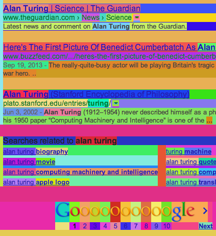
I wrote about Autumn in my last post. At the end, I mentioned jokingly that I had made Autumn into a bookmarklet. I call it Autumnify. All it does is call Autumn on every element (i.e: $("*")). The results are definitely silly and obnoxious. Autumnify turns the cleanest page into a a real horrowshow:

But after using it for a while, I noticed this thing has a few legitimate uses (skip to the end if you want to try it).
Structure
Autumnify immediately reveals the underlying structure of a page.
I bet there are other tools that do this (simply putting red borders around elements will get you halfway there), but Autumn is specifically designed to generate colors that are very distinguishable. So most of the time parent elements are going to stand out from children and siblings are going to stand out from each other.
Autumnify was a quick byproduct of something I already doing, but I do wonder if there is a simpler way. We know from the map coloring problem that only 4 colors would really be needed to distinguish all the elements on a page, but I have a hunch that's not a trivial problem.
Complexity
If the markup on a page is convoluted, you're going to know it. Simple markup, however, almost looks like an expressionist painting. It's nothing to write home about, but I tried making the HTML on this blog fairly simple:

Asynchronous content
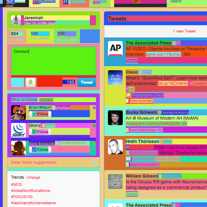
Once you Autumnify the page, it's easy to point out newly loaded content. If the page uses hash-based navigation, it's easy to tell what's being preserved and what isn't. On Twitter, for instance, you can see how new tweets stand out, obviously. But less obvious is that while navigating between tabs most of the content is kept around, yet the "Trends" container always refreshes. All you have to do is look for white backgrounds:

It's ridiculous!
Frankly, it's just a lot fun making your favorite site look like the million dollar homepage.
You can try it out by clicking on the link below. If you like it, drag the link onto your bookmarks bar. For reasons I haven't figured out, it doesn't seem to work well in Firefox.
Autumnify
And here's a version that makes all text white for a little better readability:
Autumnify (white)
Just make sure you don't shoot your eye out.
Vote on HNDiscuss on Hacker News, you know, if that's like your thing.
Hitherto
Why are CNN's headers grey?A Sucker Born Every Semester
Sneaking into Rohrer's Castle - Appendix: A Short Guide
Permalinks
Short: http://jere.in/7Pretty: http://jere.in/autumnjs-bookmarklet
